Daily, Seasonal and Weather-Driven Patterns in Utility Solar Generation
This post explores a number of real-world considerations that need to be taken into account when incorporating utility-scale solar power into the mix of electricity generation. It will cover:
- The Difference Between Generating Capacity and Actual Output: Unlike some sources (e.g., nuclear, coal), which when active can consistently generate power very close to their maximum capacity, solar does not. I will use noisy generation data from a few U.S. regions to estimate both what utility-scale solar is physically capable of generating, and also how it falls short of that capability (predictably and unpredictably).
- The Daily Cycle: Solar produces electricity only during the day, and so in the real world it produces at most half of its maximum physical output. In fact, it is somewhat less than half, because there is minimal generation in the early morning or later afternoon when the sun is low in the sky.
- The Seasonal Cycle: Both because of shorter daylight hours and lower solar intensity, solar panels in winter generate meaningfully less juice than in summer. This post goes into details.
- Differences in Geography: While there is some variability across the U.S. in the seasonal / the daily cycle of how the sun moves across the sky, geography also brings climate differences. I will look at a few solar-heavy U.S. states to see just how big these differences are, and how much they detract from solar electricity generation.
I have two goals. The first is to show real data to quantify features of solar generation that are often qualitatively presented (e.g., intermittency). The second is to begin constructing a realistic model of solar as a variable electricity supply. This supply can then be matched up against the fluctuating demand levels for electricity that I have explored in previous posts. The intersection of supply and demand can generate other interesting outputs such as (1) how much energy storage is useful to have on the grid and/or (2) how much “overcapacity” of electricity generation needs to be built to fill gaps.
Hourly Generation Data from the EIA
Data in this post comes from the U.S. Energy Information Administration. The EIA’s Hourly Electric Grid Monitor, has hourly granularity by region on a number of variables. These include total usage and generation in the region (balanced by import / export from neighboring regions), as well as a detailed look at generation by type of source (e.g., coal, nuclear, natural gas, solar, wind).
An example of the latter is below, which shows the daily cycle of solar generation, and how natural gas plants are ramped up and down each day to offset the solar daily cycle. The chart also shows how on some days, solar generation is weak due to weather (the end of December 2022 saw a lot of clouds and rain in the Western U.S.), and how on these days natural gas production doesn’t ramp down as much.
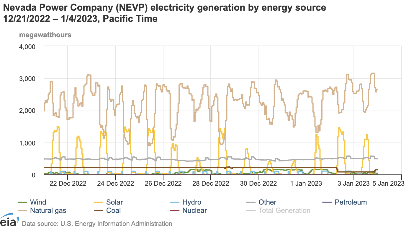
I focus mostly on Nevada’s balancing authority, Nevada Power.1 Besides living here, I chose this region because it is mostly desert. With less weather obstruction, I will be able to get a more accurate picture of idealized / unobstructed solar productivity. All data is from 2022.
Ideal Solar Generation: Methodology
Step “zero”, before understanding the daily and seasonal flucutations of solar generation, is to identify the maximum possible output of the installed panels under ideal sunlight conditions (i.e., summer mid-day). I will refer to this as the maximum physical output of the solar generation system. For Nevada Power in 2022 that was 1,983 MWh per hour (derived using the average of the top three hours of production throughout the year). Assuming that for these few hours the system was outputting its full capacity, this is equivalent to saying that Nevada Power includes roughly 2 GW of utility solar generation.
Next I turn to identifying ideal solar generation as a function of day / night and seasonal changes in sunlight, stripping out the effects of weather.
Since I am trying to derive this function from “actual” generation data that includes weather obstruction, I use the data itself to separate good weather days (close to ideal solar generation for the time of year) from bad weather days.
First, I assume that that ideal solar generation is uniform throughout the calendar month. In other words, this assumes day length and angle of the sun are consistent throughout the month. This is approximately true for winter and summer months (the day length at Boulder City, NV varies from 9 hours 42 minutes to 9:53 in December and from 14:26 to 14:36 in June). It’s a rougher approximation in spring and fall (March ranges from 11:25 to 12:33 and 11:51 to 12:55 in September). But this assumption will enable me to estimate ideal solar generation from the best generation hours and days within the assumed-constant month.
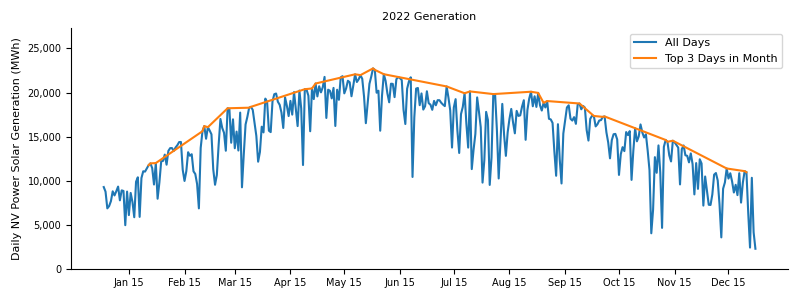
The chart above shows how meaningful weather-driven inconsistency is even in a desert area. The noisy blue line is actual output by day in 2022. The orange line connects the top 3 days of output in each month, and could be a starting point for estimating maximum generation capacity. But even the highest-producing days in a month could still have a couple of horus of clouds and so underestimate that month’s ideal solar generation. In the chart above, July and August (monsoon season in the desert southwest with a surpring amount of rain) may have this problem, as even the orange curve falls short of what I’d expect given the April through June data.
A more robust approach is to, for each of the 24 hours of the day, find the instances where solar generation during that hour was among the top three of generation in that specific time slot in the month. For example, I estimate the ideal solar generation in the 10-11am time slot in July by looking at output for the thirty-one 10-11am hours in the month of July, and taking the top three. These may occur on different days than the 2-3pm time slot. If one day has morning clouds and afternoon sun, while a second day has morning sun and afternoon clouds, I can compute the solar generation capacity in the period using the first day’s afternoon hours and the second day’s morning hours.
Here’s what happens in July 2022 using the two alternative approaches:
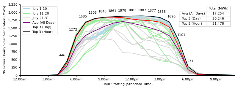
The hour-by-hour approach makes a difference. The light blue lines indicate that the first part of the month had weak morning generation but strong afternoon generation. Later parts of the month had some days with strong morning output but inconsistent afternoons. Taking the best 3 complete days results in a capacity estimate of 20,200 MWh per day, with a better morning than afternoon profile (seemingly taken from the late-July days). Taking the best 3 hours for each hourly slot increases this to 21,500 MWh per day – 6% higher and much more likely a more complete picture of what generation could be in July.
Seasonality of Ideal Solar Generation
Applying this approach to each month of 2022, I generate the following ideal solar generation function in Nevada for each month (ignoring weather obstructions or other outages).
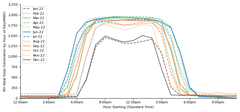
One key result of this analysis is that solar plants in the winter can only generate about half as much electricity per day as in the summer, for two reasons.
-
The maximum generation per hour is higher in the summer due to the higher angle of the sun in the sky (approaching the maximum physical output). Full sun in December generates only ~77% as much power as full sun in June.
-
The winter has fewer hours of sunlight per day. In June, generation runs from the 5-6am slot until the 6-7pm slot.2. Contrast December, where generation runs from the 7-8am hour until the 3-4pm hour. Both of these stats are in-line with the length of daylight hours in the summer and winter outlined above (15+ and 9+).
Note also that the “shoulder” months in the fall and spring are closer to higher summer than they are to lower winter production. For example, ideal solar generation per day in March is 84% that of June (compared to December at 52%).
| Ideal Solar Generation | |||||
|---|---|---|---|---|---|
| Month | Daily Generation Capacity (MWh) | Monthly Peak Hour (MWh) | Hours Active per Day3 | Equiv. Hours @ Monthly Peak | Equiv. Hours @ Maximum Physical Output |
| March | 18,931 | 1,924 | 12 | 9.8 | 9.5 |
| June | 22,515 | 1,952 | 14 | 11.5 | 11.4 |
| December | 11,689 | 1,505 | 9 | 7.8 | 5.9 |
| 24h x Max. Physical Output | 47,584 | 1,983 | - | - | 24 |
The second key observation is that while solar actively generates some power about half the time, there are 1-2 hours at each end of the day with lower output when the sun is low in the sky. So 14 hours of active generation in June in reality is about 11.5 hours worth of peak June sun. Similarly December – power is on for 9 hours a day but sunrise / sunset make this worth only about 7.8 days of mid-day December sun. Effectively, the sun works somewhat less than half-time.
Finally, the table above references the hypothetical generation of Nevada’s solar installations using their maximum physical output. If sun were at maximum summer strength for 24 hours a day, Nevada solar would generate 48,000 MWh in a 24 hour period.
While it is impossible for any Earth-based system to get anywhere near 100% of maximum phsyical output, this can still be useful benchmark because we can measure all other outputs against this quantity. Even before taking into account weather, some geographies may be better at taking a fixed capital input (a solar panel) and converting it into electricity due to latitude, angles of the sun and permanent obstructions like mountains or nearby forests. Some generators may also be better in managing their solar generation assets as an operational and engineering matter (for example, ensuring solar panels adjust to follow the sun), and using this benchmark can help suss this out.
Putting it All Together
Now we can paint a full-year picture of the ebbs and flows of solar generation in Nevada. Against the (unrealizable) maximum physical output benchmark, we will see how much of that benchmark is produced and when, taking into account (1) daily cycles, (2) seasonal cycles and (3) weather, to reach actual production.
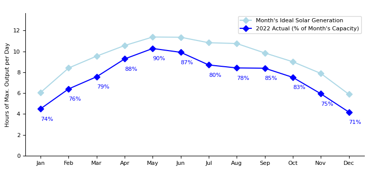
Compared to the full-blast maximum physical output of Nevada solar of 1,983 MWh per hour, we see that ideal solar generation throughout the year runs between 5.9 hours worth of output in winter (25% of maximum physical output) outputs in the winter and 11.4 in the summer (48% of maximum physical output). The full-year average is 9.3 hours of maximum physical output per day (39% of maximum physical output).
Actual generation in 2022 was another 10% to 30% lower than the ideal solar generation, depending on the month (18% on average). It ranged between 4.2 hours worth of maximum physical output in December to 10.3 hours in May. The full-year average was 7.6 hours worth of maximum output per day (32% of maximum physical ouptut).
The months where the weather slippage was the greatest are not surprising to me given my experience of Nevada weather – there can be cloud cover and sometimes precipitation in the coldest part of the winter, and there is the summer monsoon season in July/August with frequent rain as well.
Exploring Different Geographies
Ideal Solar Generation Curves
Finally, I performed the same analysis above on three other locations in states with relatively high solar energy penetration – Texas and parts of Florida and North Carolina.4 Below is their patterns of ideal solar generation: solar capacity throughout the year in each locale taking into account seasons and day lengths but stripping out generation shortfalls due to weather or other interruptions. As above, I benchmarke against maximum physical output for an hour in that location.
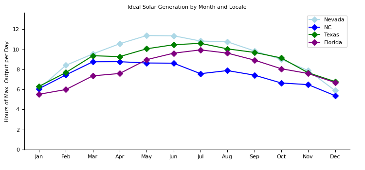
While the general pattern of summer peak and winter valleys is consistent, the heights of these curves is not intuitive. I was expecting climate variability in different locations to drive divergence in actual solar genration. But because all of these locations are in the southern tier of the continental U.S., I was not expecting much difference in pre-weather ideal solar generation. But they are quite different: the average ideal generation throughout the year is 9.3 hours, 7.5 hours, 8.9 hours and 8.0 hours in Nevada, North Carolina, Texas and Florida, respectively.
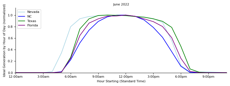
One (speculative!) possible explanation is that different utilities in different locations have different physical panels that contribute to differential effectiveness in capturing sunlight. For example, when looking at the June hourly capacity chart for different locations (below), notice that in North Carolina, generation is only briefly at its peak; whereas in Nevada, the shape of the curve is a flat-topped plateau (5 hours above 90% of peak for NC, vs. 9 hours for NV). If the Nevada utility had motorized solar panels that could track the sun across the sky, while the North Carolina utility did not, this type of chart might result.
Weather
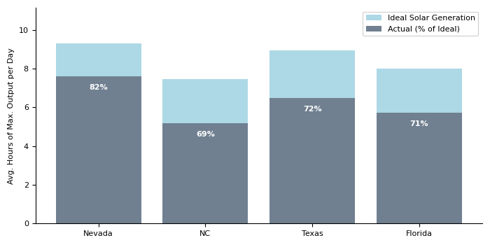
Finally, we see the impact of the weather. Desert state Nevada loses relatively little solar output due to non-sunny skies, and in 2022 its average production was 7.6 hours (18% below ideal solar generation levels). The other locales have more variable weather with greater cloud cover and precipitation, and as such suffer ~30% generation loss compared to their ideal solar generation levels. Texas comes in second with average actual production equivalent to 6.5 hours of maximum physical output per day, Florida at 5.7 hours, and North Carolina at 5.2 hours.
ChatGPT
In this post, I got a small amount of help from querying ChatGPT to find convenient python library functions to use (and how to use them), rather than searching for them on the internet or reading about them in package documentation. It was definitely labor-saving, and I expect to be doing more of this in the future to speed things along.
-
It’s not clear to me exactly what region this covers. The balancing authority map on the EIA website suggests that this the less-populated area of the state excluding the Las Vegas area in the southern extreme. However, NV Power, which also does business as NV Energy, services the entire state as an electric utility, and its solar assets include those in the Las Vegas vicinity ↩
-
All times have converted to Standard Time for comparability, which is why the sunset time in June may seem early for those used to Daylight Savings time. ↩
-
Defined as hours in which ideal solar generation is at least 10% of the peak hour during that month. ↩
-
Specifically, in North Carolina I used the region covered by the balancing authority “Duke Energy Progress East” and in Florida, “Duke Energy Florida.” Larger regions appeared to suffer from incomplete data. ↩